
You must be signed in to view this page

Contact James for access, you may use the form below.

Ask for password white mode


Optive

Feel the difference


Optive – Feel The Difference
Optive – The Ripple Effect – OMEGA
Optive – The Ripple Effect – GEL DROPS
Optive – Drop Fusion
Optive – Drop Fusion – FUSION
Optive – Drop Fusion – DIGITAL
Optive – Iris Artistry
Optive – Iris Artistry – DIGITAL
Optive – Iris Artistry – OMEGA
Optive – Eye Feel Great
Optive – Eye Feel Great – FUSION
Optive – Eye Feel Great – GEL DROPS
Optive – Refreshing Change
Optive – Refreshing Change – DIGITAL
Optive – Refreshing Change – GEL DROPS

OPTIVE

Feel the difference


What I Did

Brand proposition

Creative and art direction

Design

Background

Optive is a global eye care brand with a broad portfolio of eye drops from over-the-counter consumer products to prescription treatments. Following the development of a new brand strategy, identity and proposition – Feel The Difference – the task was to redesign the packaging for the entire product portfolio.

The problem

Over time, Optive’s packaging had become disjointed and inconsistent. Different designs existed for different markets and audiences, making the range feel fragmented and hard to navigate. Our job was to bring clarity, cohesion and shelf appeal to the Optive portfolio, using design to unify the brand and clearly communicate the benefits of each product.

The idea

Our solution needed to deliver consistency, flexibility and distinction. We developed a series of design concepts that reimagined the Optive portfolio as one cohesive, compelling range. Each concept embodied the new brand proposition – Feel The Difference – in a way that both HCPs and consumers could connect with. From soothing visuals and visceral textures to ownable language and bold signposting, every idea aimed to elevate the everyday, stand out on shelf, and clearly communicate the role of each product in the range.

The Ripple Effect
A calming system built around overlapping ripples that subtly form the shape of an eye.

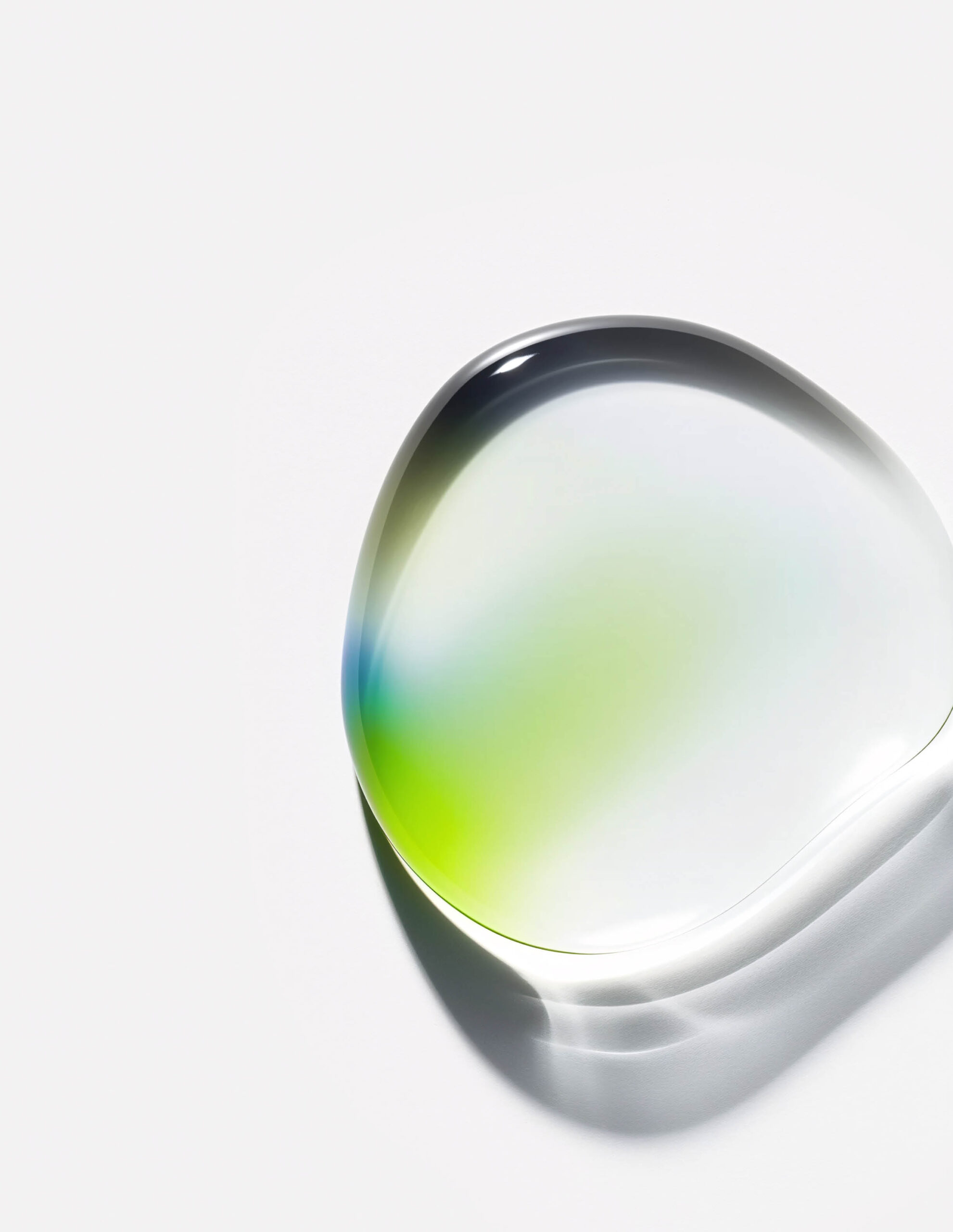
Spectrum Drops
A liquid drop design with refracted colour that visually captures hydration and relief.

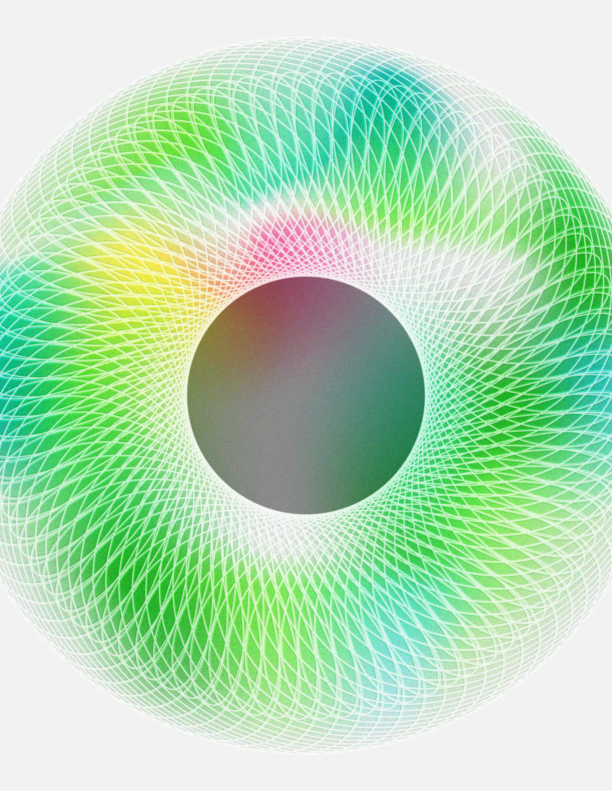
Iris Artistry
Striking, minimal packs inspired by the unique textures and patterns of the human iris.

Eye Feel Great
A tone-of-voice-led design that brings warmth, charm and emotional connection to the pack.

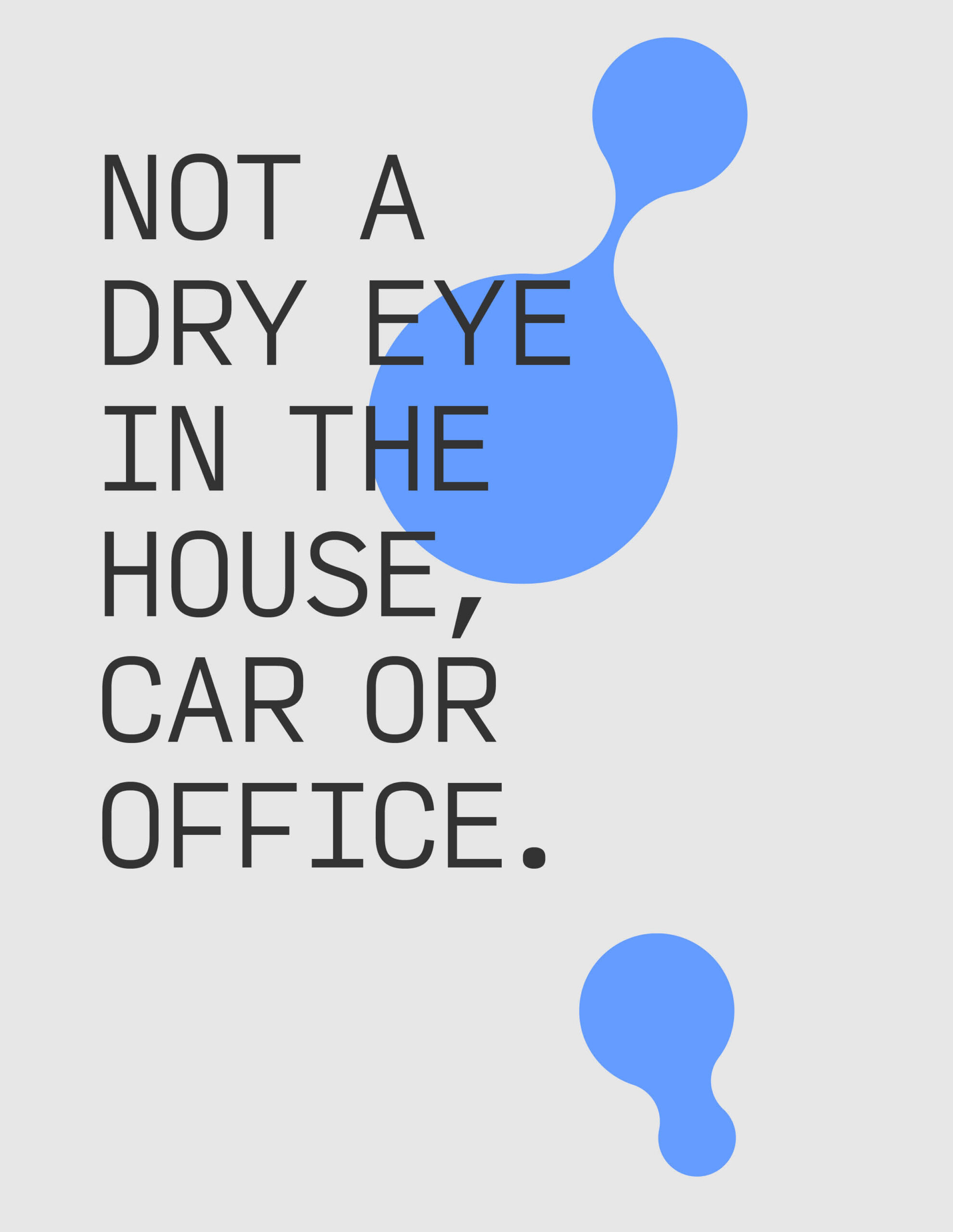
Refreshing Change
A sensorial, uplifting concept that visually expresses the instant relief of each drop.

The impact

The designs were presented to Optive’s US and European brand teams and received overwhelmingly positive feedback. Each concept sparked debate, with stakeholders championing different favourites and appreciating the strategic thinking behind every approach. The Ripple Effect, Iris Artistry and Refreshing Change were selected to go into consumer testing, and the final pack design is set to launch globally in the near future.