What I Did
Name
Creative and art direction
Logo
Visual identity
Design
Background
At Havas Lynx, teams are structured like self-sufficient creative agencies. Each is built to deliver independently while avoiding conflicts between competing brands and pharmaceutical clients. This model ensures flexibility, focus and the ability to respond quickly to the needs of both clients and the business.
The problem
Following a restructure, our team needed a new identity. One that reflected who we were creatively and culturally, and helped us stand out within a network of equally talented teams. The challenge was simple but important: how do you brand a team of creatives for creatives?
The idea
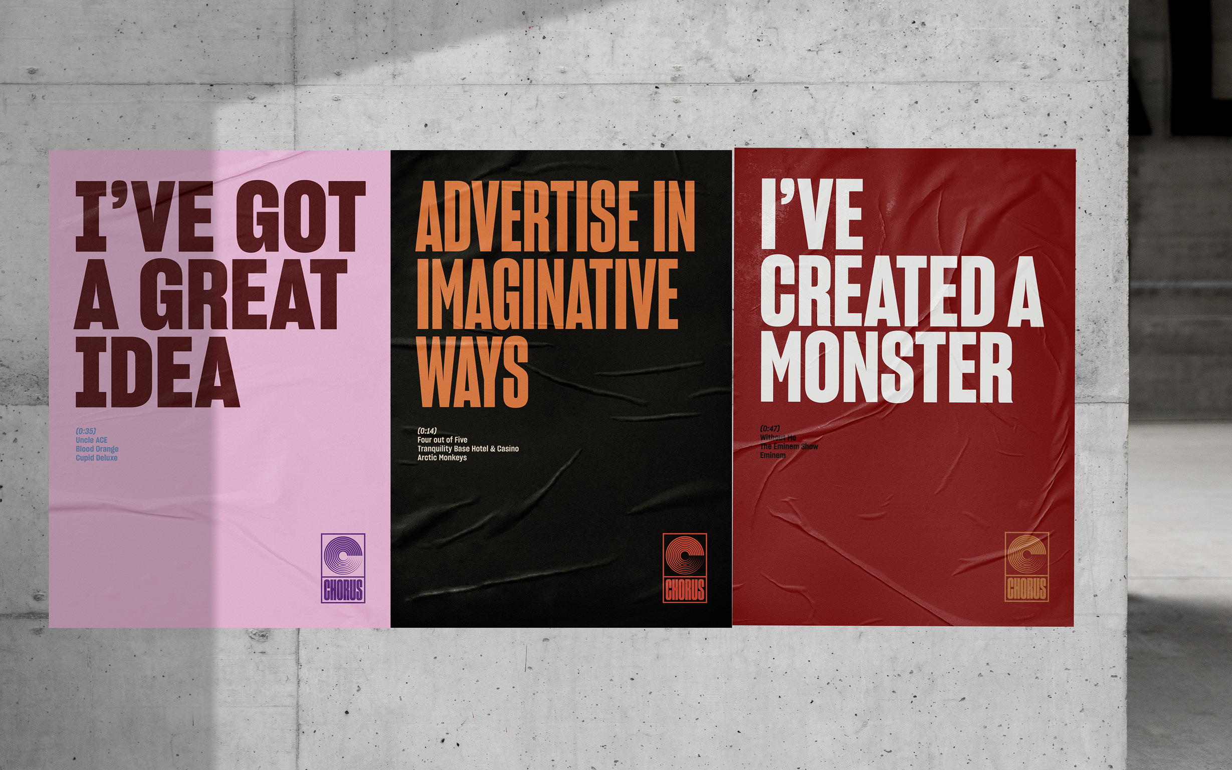
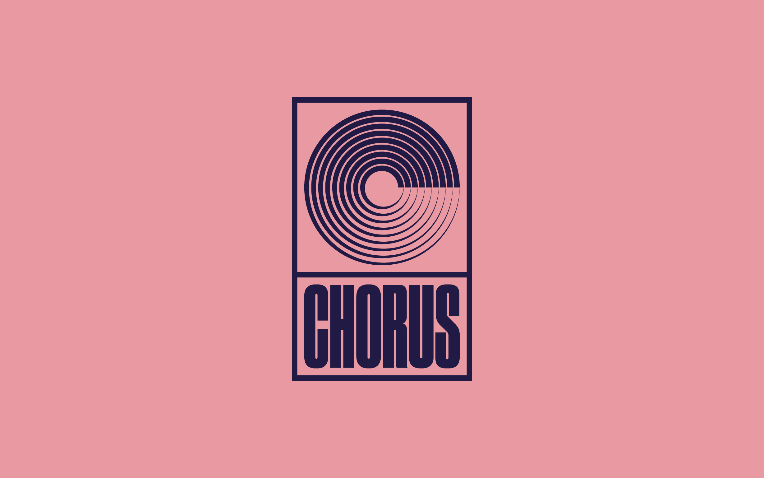
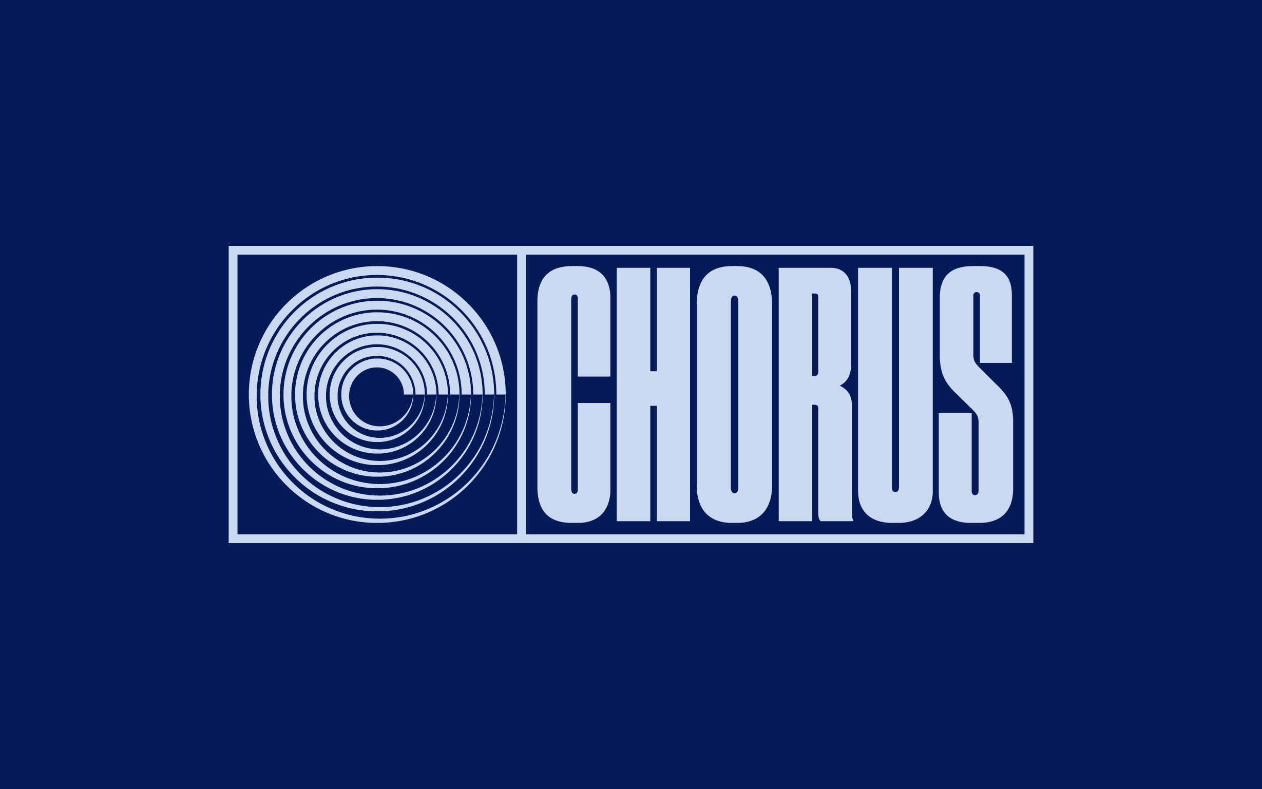
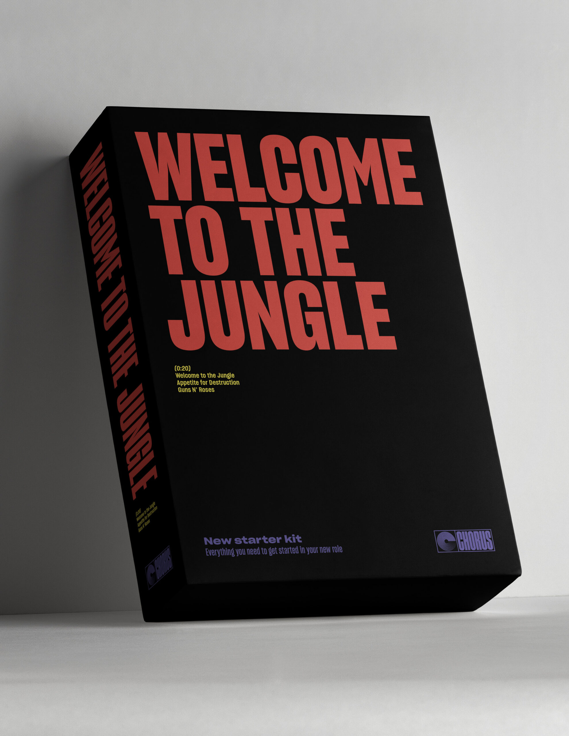
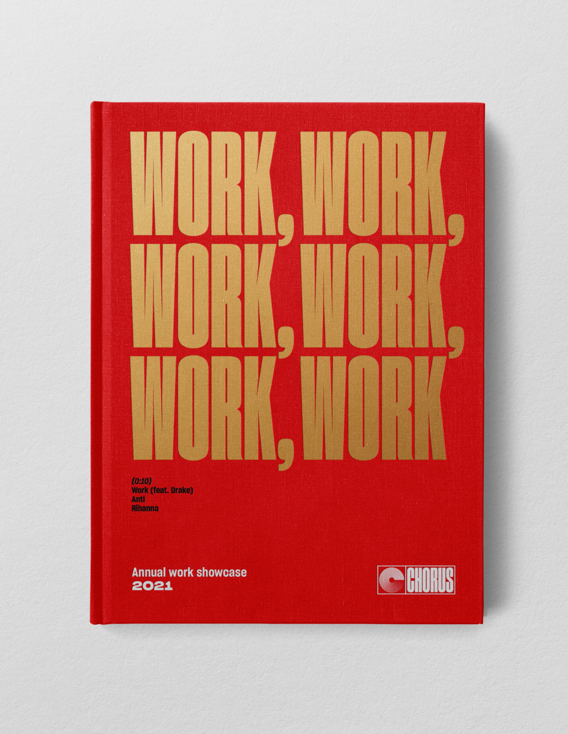
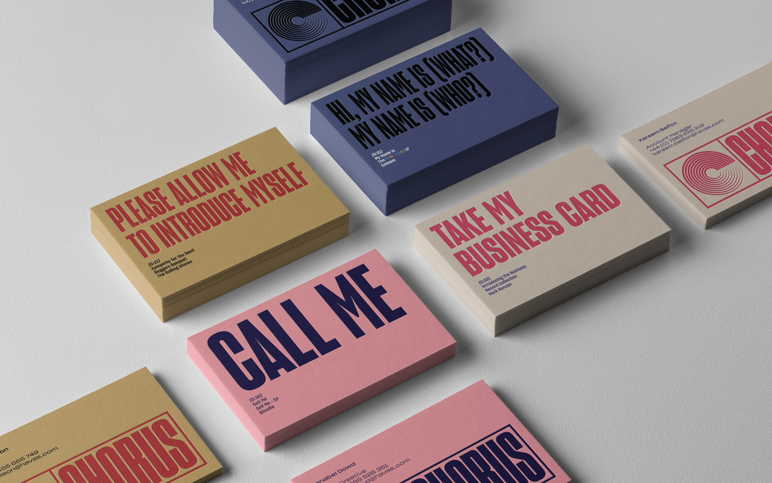
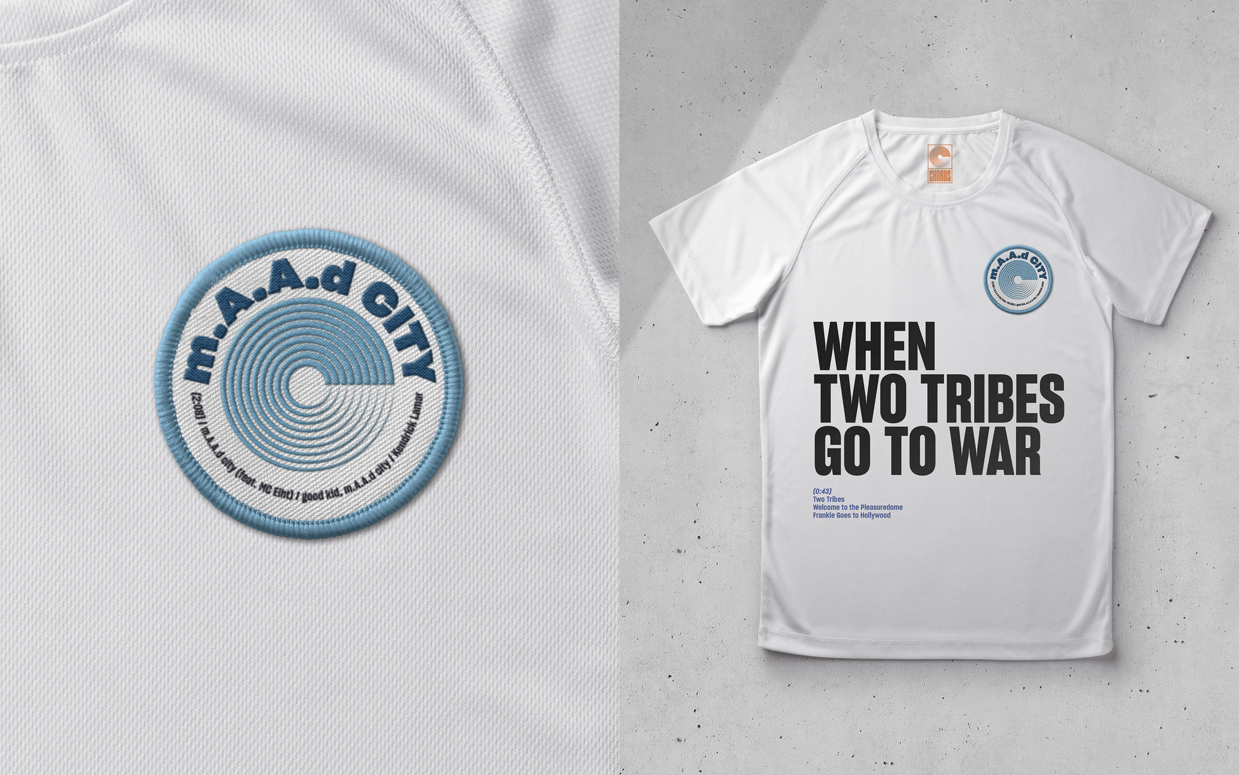
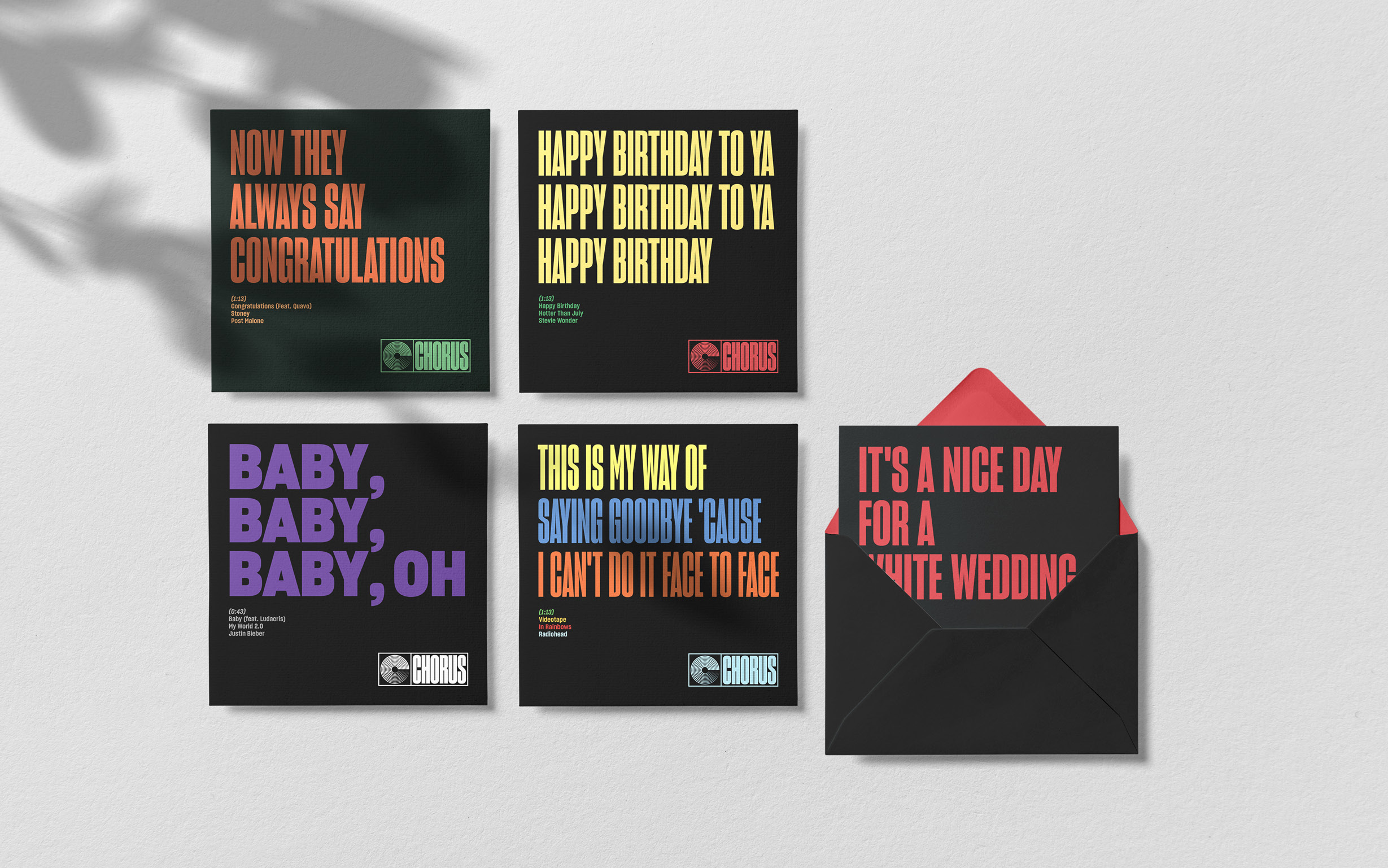
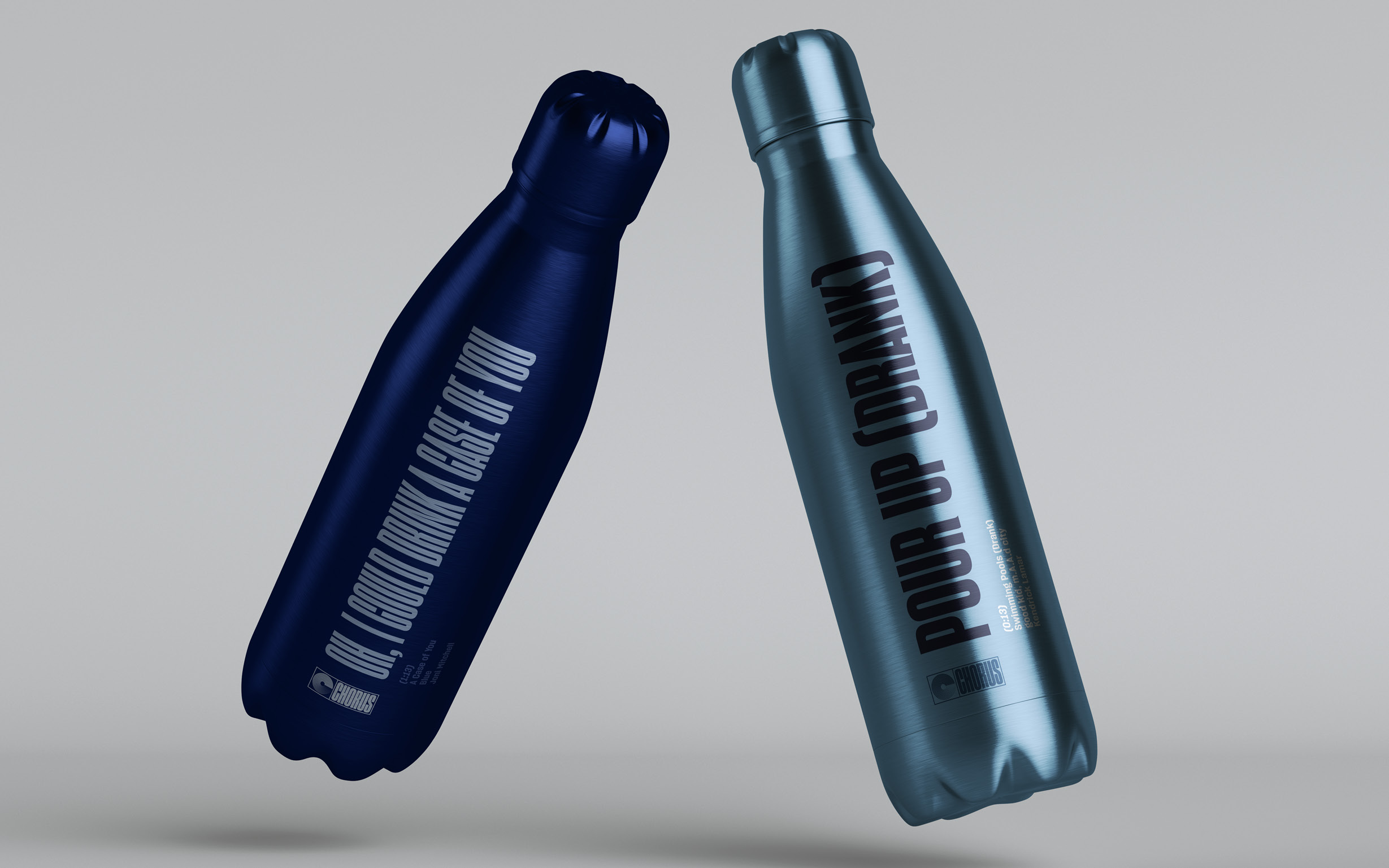
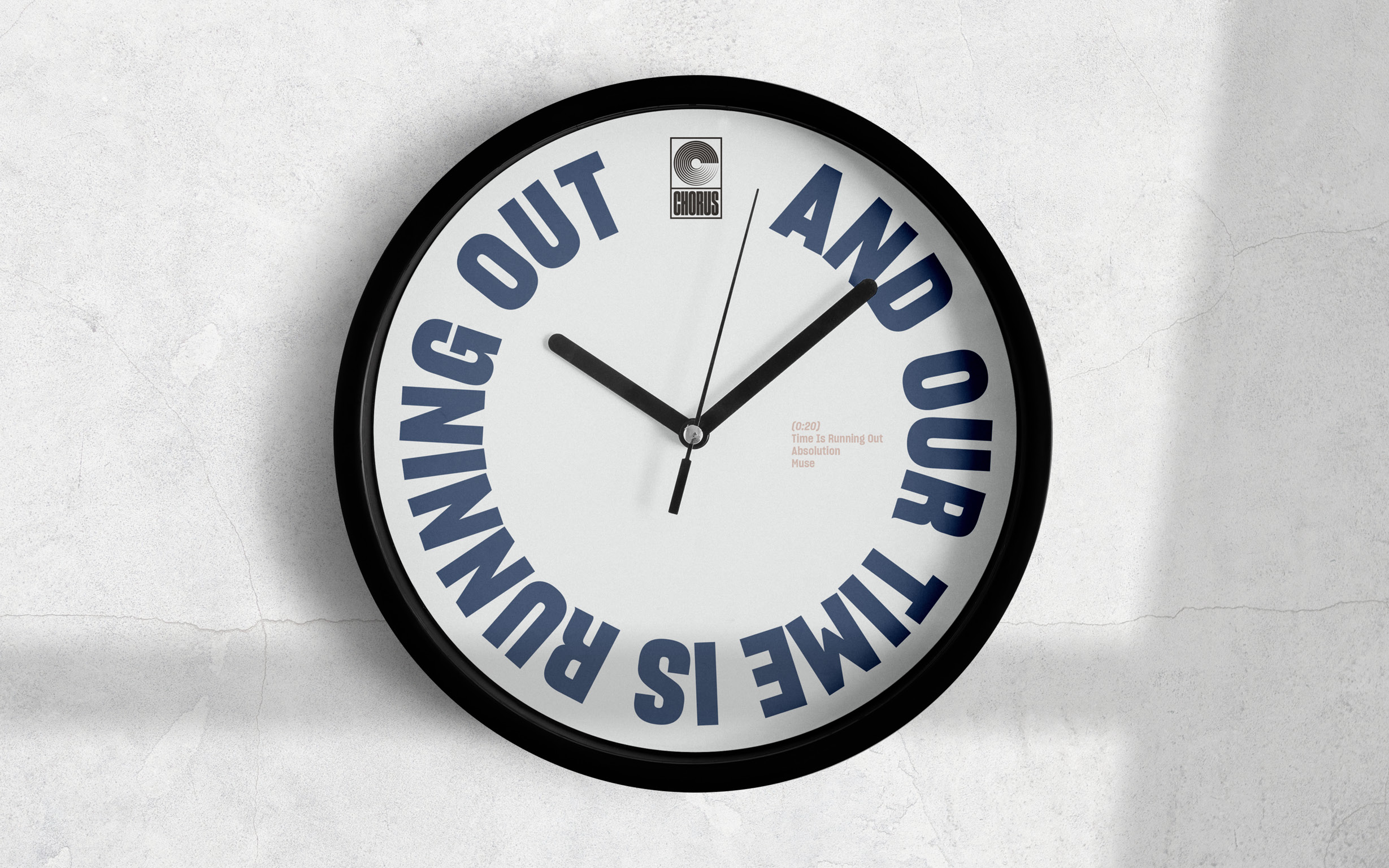
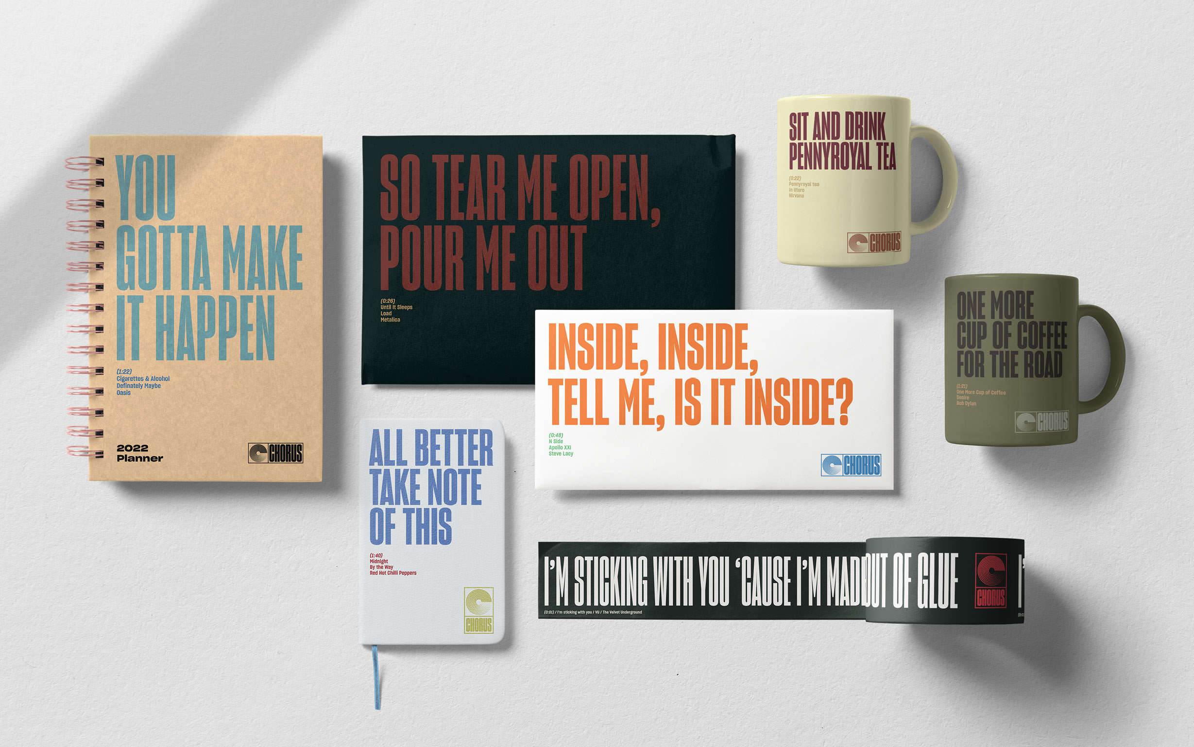
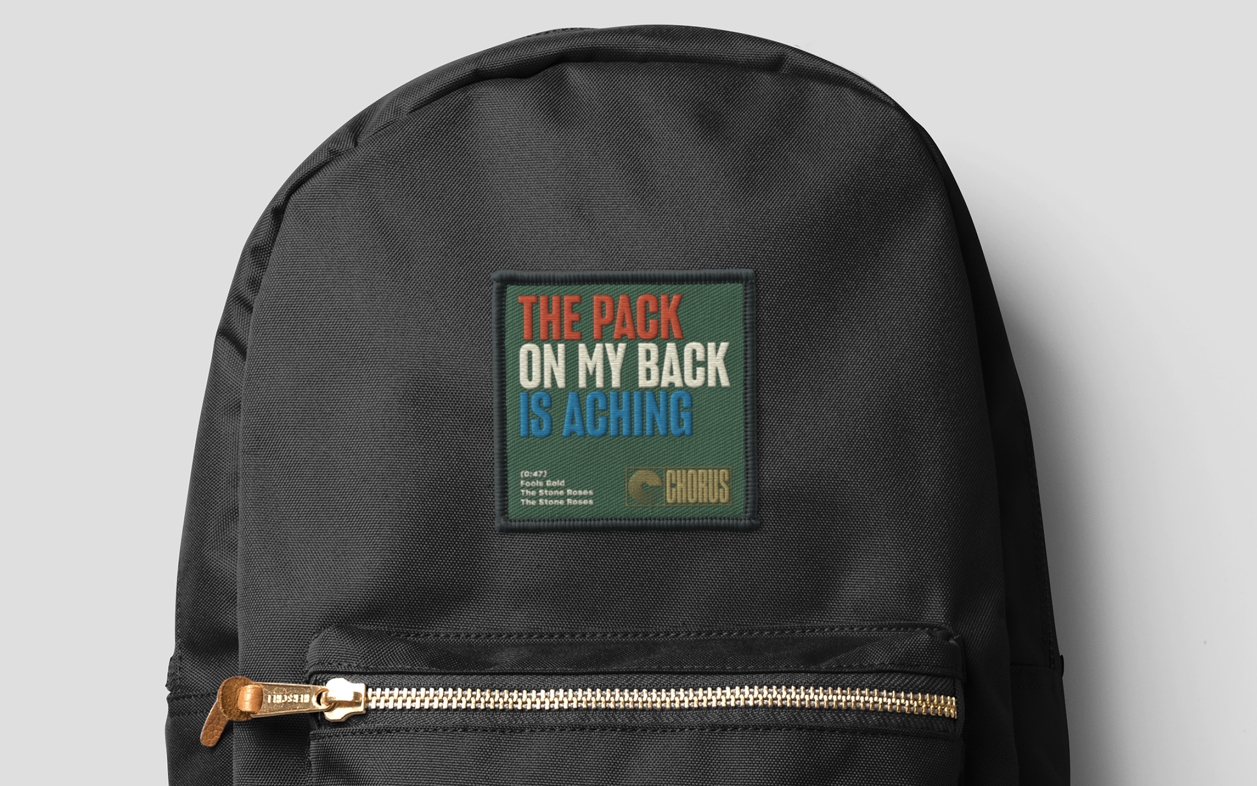
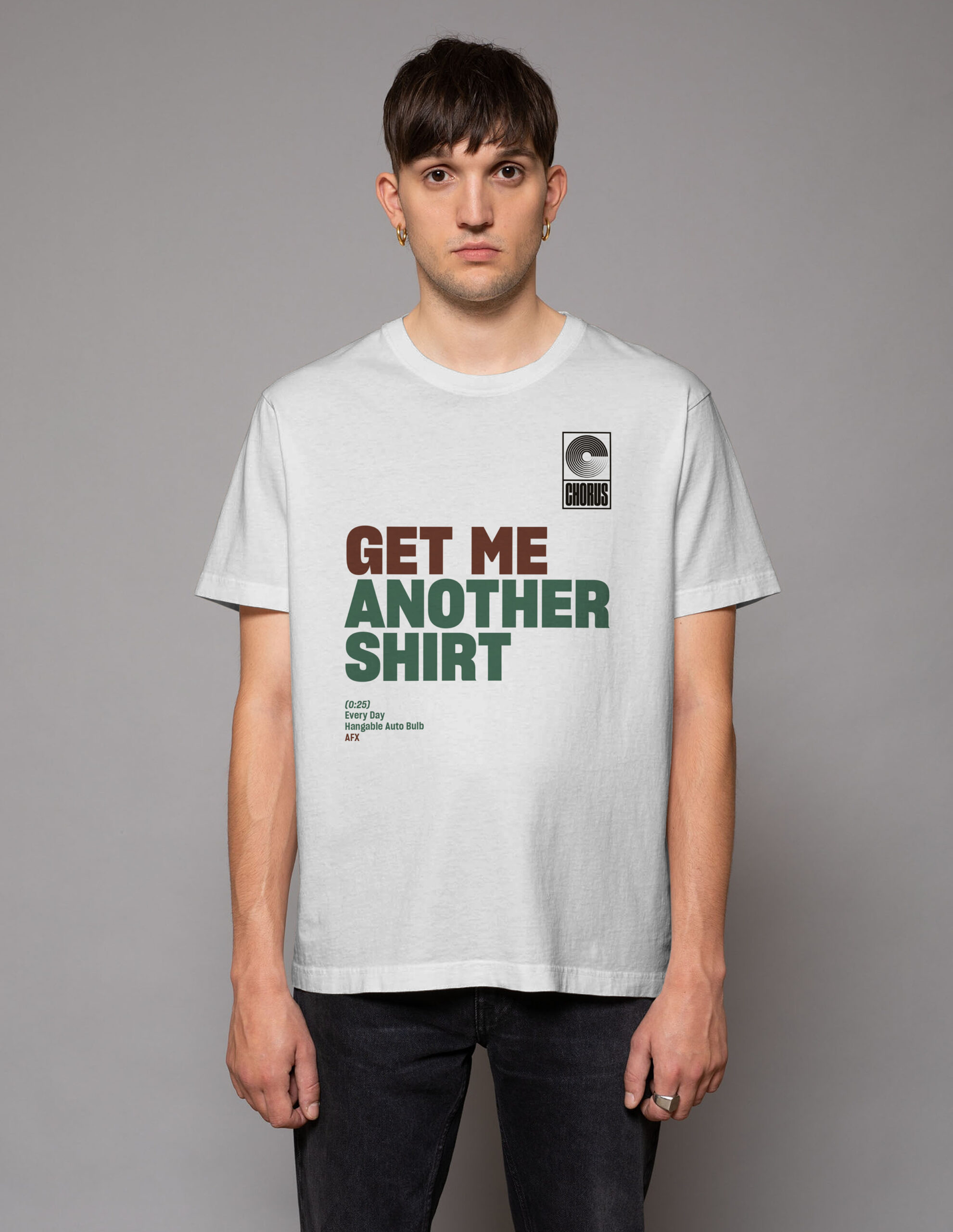
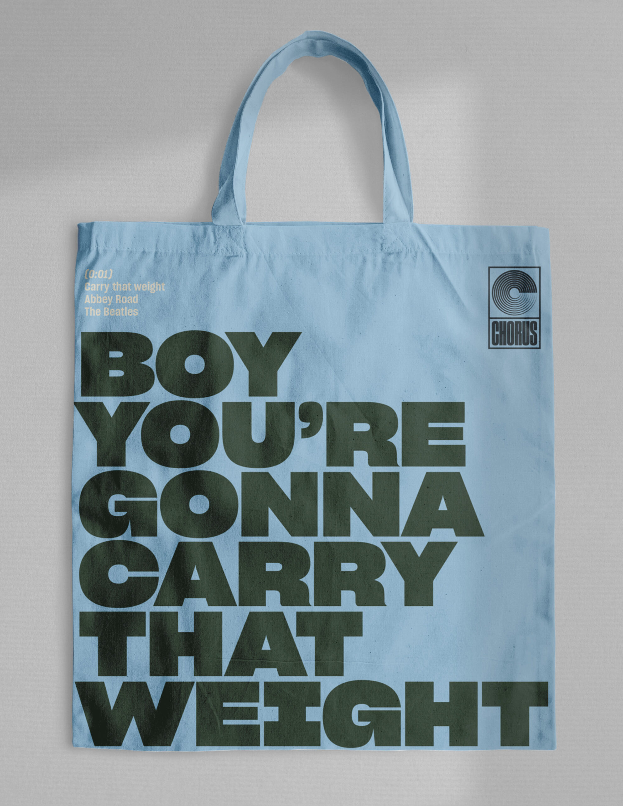
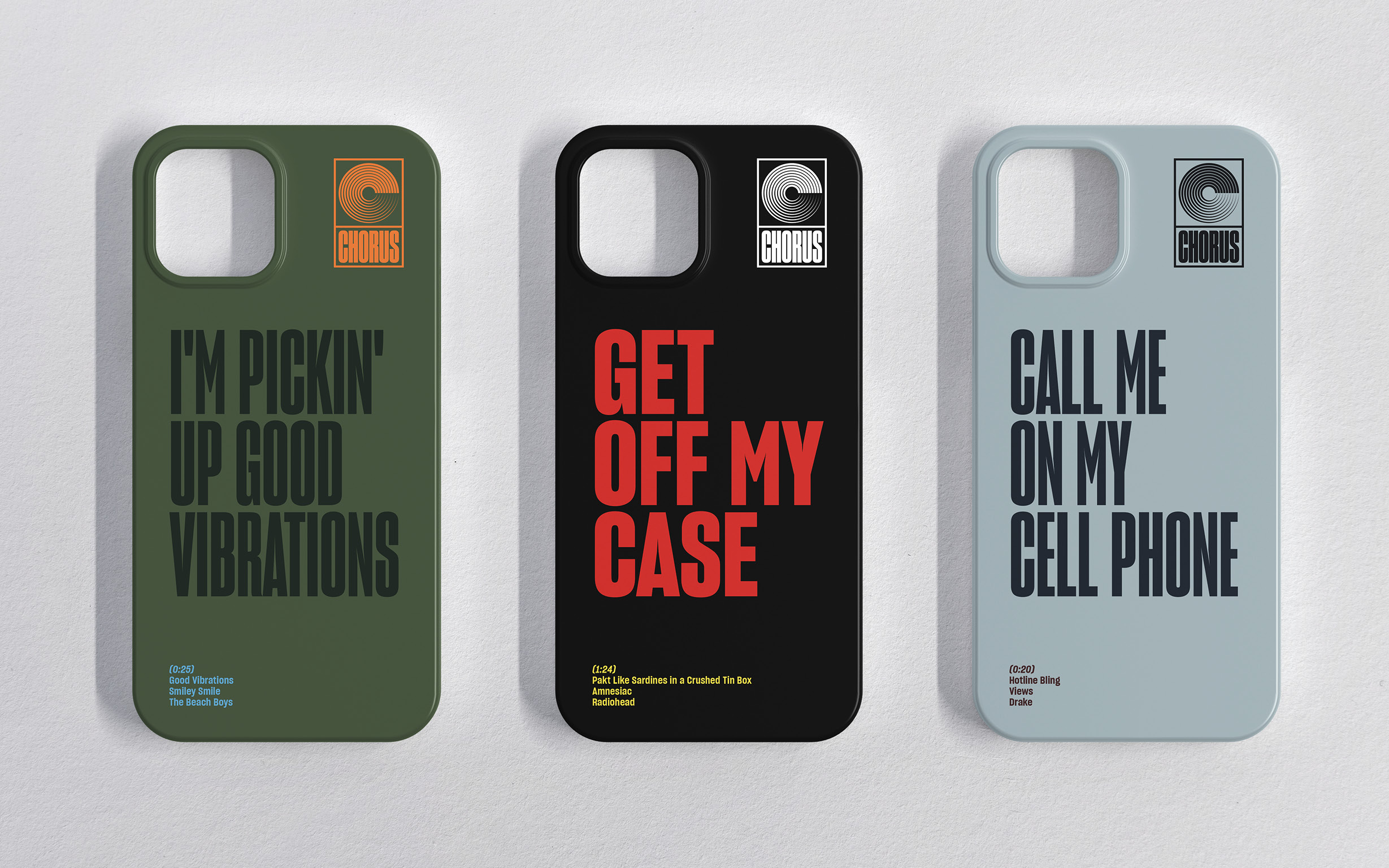
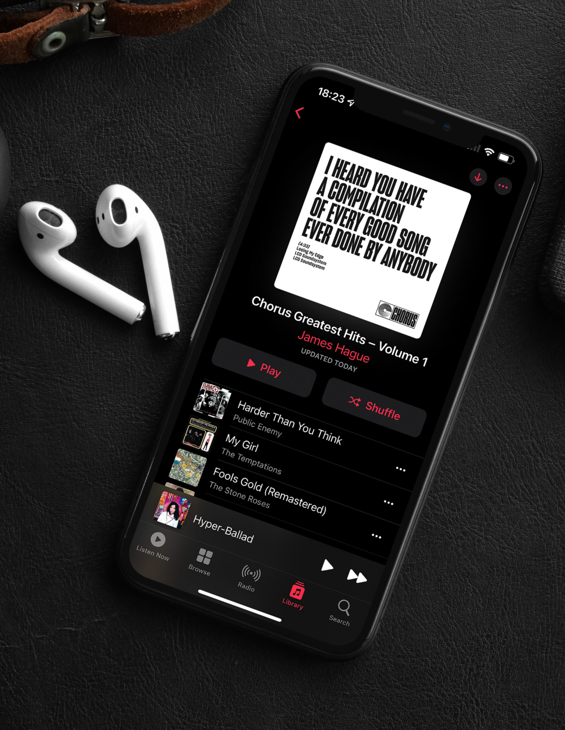
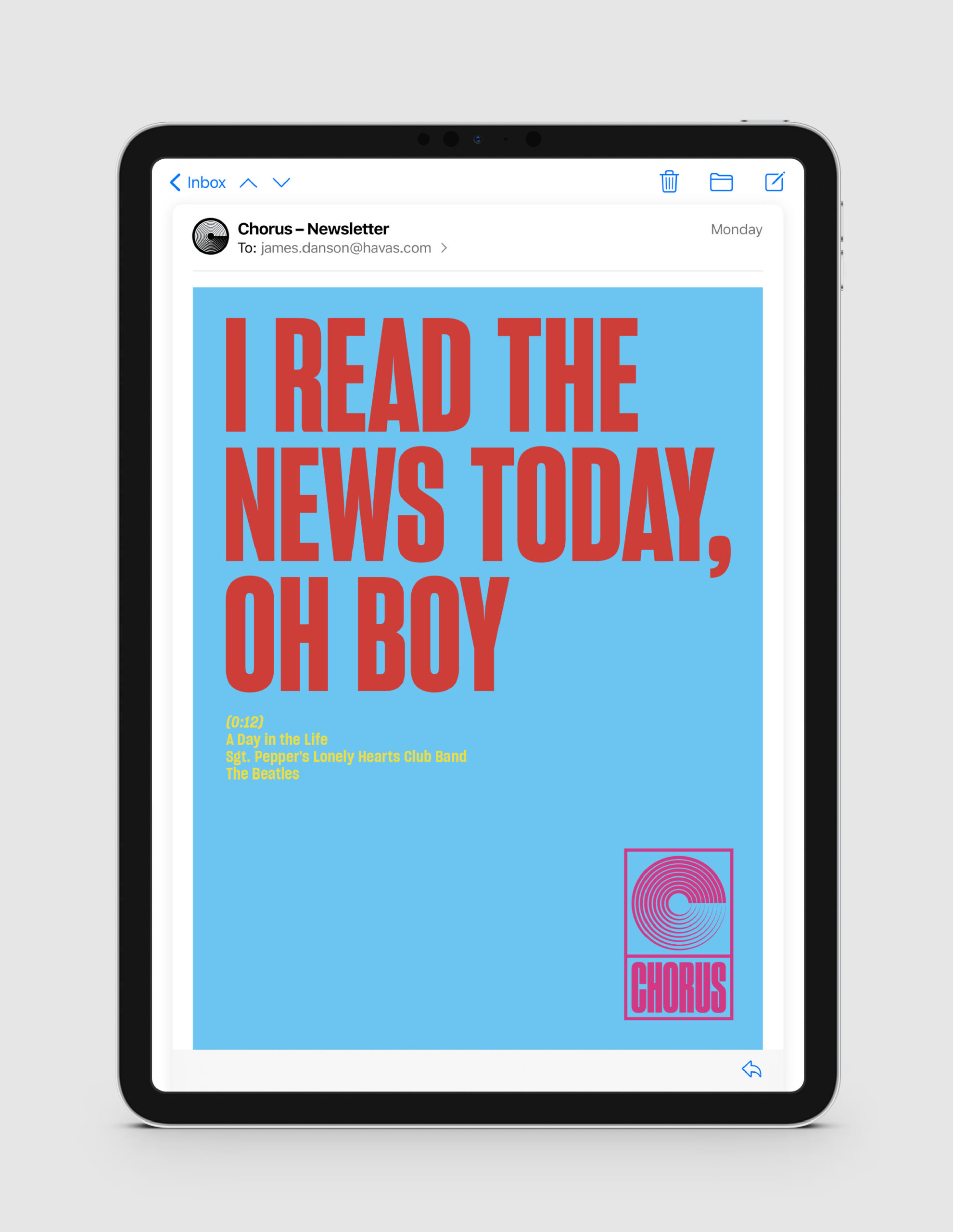
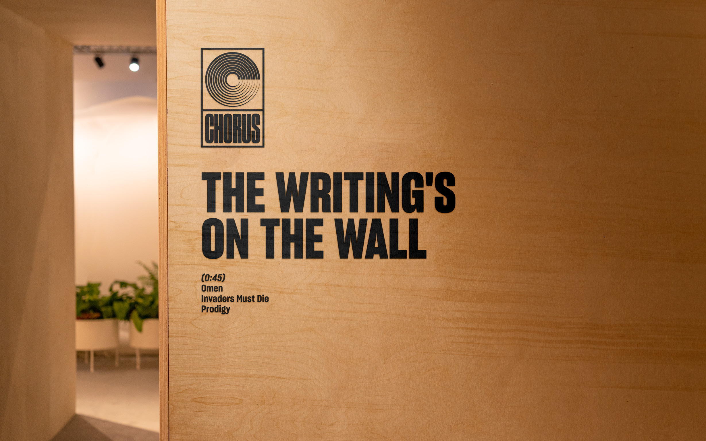
Inspired by the world of iconic record labels like Columbia, Motown, RCA and Interscope, the logo features a bold letter C that evokes a vinyl record and visually ties the identity together. For the visual identity, we created a flexible design system built around the idea of greatest hits. Lyrics became content. Colour palettes were sampled from real album covers. And the identity flexed across everything from team playlists and office posters to personalised business cards, merch and internal presentations, making even a quarterly finance deck feel like a headline act. A fun, flexible system that could grow endlessly, just like our back catalogue.
The impact
The result was a brand within a brand. One that helped us cut through, show off and spark real pride in our work. A team that sounds as good as it looks. Chorus stood out and started making noise.